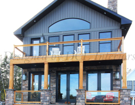
 Caroga Lake House
This beautiful lake house was intricately designed and carefully curated from the ground up. This luxury home with breathtaking views is washed in light from the many custom and large Anderson windows. We walked the clients through the material selection process, opting for as many natural and rustic pieces as possible while still remaining chic. We were not looking to make it look like a log cabin in the woods or anything. The house sports reclaimed wood, locally quarried stone, hickory hardwood floors, Cambria quartz countertops, textured stone backsplash tiles, walnut and hickory vanities, matte black plumbing and lighting fixtures and pulls, a reclaimed corrugated metal rolling island, barn doors, farm sink, reclaimed wood hood, custom locally made lighting fixtures, custom locally made rustic furniture, custom made antler chandelier, reclaimed pine planks for the ceilings and all topped off by one of the owners hunting trophies. However, all the beautiful and cozy interiors that we could possibly contrive inside cannot compare to the utterly breathtaking God created natural beauty through the windows and right outside the doors!
|
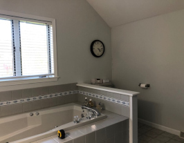 37 Fields End Drive
This outdated and poorly architecturally planned early 2000’s master bath was completely redesigned with a new plumbing layout for all the fixtures and a brand new design concept. The client was inspired by the seaside hotels of Europe, so we settled on this Portuguese seaside theme with hand-painted Portuguese style marble tiles imported from Europe. The cabinets are a deep blue, very reminiscent of the ocean with similar blue veining in the Cambria quartz custom countertop and shower pieces. The bathroom sports a luxurious soaking tub with freestanding tub filler and a huge walk in shower with niche and bench seat. We were even able to fit a separate toilet room for added privacy to add to that high end hotel feel. Unfortunately, we were not able to get back to this project to take our final pictures so we are using the pictures of the 3D model that we present to our clients for approval before drafting their construction plans.
|
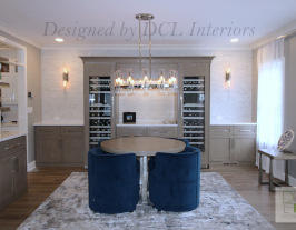 1300 Queen Mary Boulevard Dining Room
This tired, dated and gaudy early 2000’s era dining room received an elegant redesign and a repurposing of the entire space. The little used room became a catch-all for the client and their busy family. They wished to reclaim the space to use for housing their wine collection and entertaining family and friends. Architectural features such as the open pillared arched entryway, the wainscotting and the tray ceiling were removed and modernized. The entire first floor of the house received new luxury flooring. Custom cabinets were installed for the obvious storage needs of this family. Top of the line Thermador wine coolers and beverage cooler drawers were added to turn this space into the wine storage and entertaining space they desired. Brand new luxury polished nickel lighting was added, as well as an elegant Carrara marble backsplash behind the wine storage space.
|
| See More Images | See More Images | See More Images |
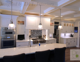 1300 Queen Mary Boulevard Kitchen
This tired, dated and gaudy early 2000’s era kitchen received a lighter, brighter and more streamlined makeover. Architectural details like doorway openings were made consistent. The cabinets received a new two-tone paint job. Cabinets were added and modified to make the most of the space and also house the brand new Thermador appliances. A brand-new sink, faucet and decorative hardware added more function and style. The intricate crown mouldings, spindles and hood were removed and replaced with more simple cove crown mouldings and simpler lines. The transom cabinet doors received new frosted glass panels. The kitchen also boasts brand new Cambria quartz countertops and a brand-new backsplash featuring beautiful blue sea glass over the professional new range top to match the island.
|
 29 Stevens Drive Main Bathroom
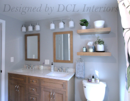
This dark and dated 1970’s avocado bathroom received an ADA accessible contemporary remodel with beachy vibes. The client’s needs were to make the space more useful, efficient and better suited to their mobility needs. The tub/shower is a piece of cake to clean with wall panels from The Onyx collection and grab bars for easy access to the get in and out. The new vanity offers more functional storage solutions as well as a double sink for guests within a luxurious Cambria quartz countertop.
|
 30 Rymm Road Main Bath
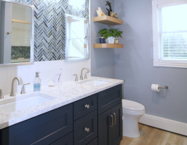
This main bath received a major overhaul from its original builder grade state. A custom tile tub/shower was created complete with niche, high end showering fixtures and custom glass enclosure. Sea glass tile, Cambria Quartz, custom vanity, floating shelves, Kohler plumbing fixtures and viny plank flooring were chosen with a soothing beach feel in mind
|
| See More Images | See More Images | See More Images |
 30 Rymm Road Master Bath
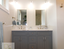
This master bath and master closet received a major overhaul from its original builder grade state. A custom tile shower was created complete with bench, niche, high end Brizo showering fixtures and custom glass enclosure. A personalized makeup area was added with sconces and product storage. Japanese sea glass, Cambria quartz, wood plank tile flooring, high end Brizo accessories, and Kohler plumbing fixtures. The master closet received all new custom components for their storage and organizational needs.
|
 315 County Fair Road Master Bath
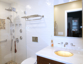
This tiny and cramped 1980’s master bathroom received a luxurious space saving remodel to rival any hotel bathroom. To create more functional space, we decreased the size of the toilet and installed a wall hung option by Kohler which not only opened up the space but also made it easier to clean. It also afforded us more space to increase the size of the shower and the vanity. This bathroom boasts heated floors and a heated towel rack for our frigid Northeast winter mornings. The Kohler Artist sink is lit from underneath to glow at night as a nightlight, as well as underneath the vanity itself! The bathroom was also designed for aging in place in mind, complete with grab bars and a zero-threshold shower floor. The shower itself is a spa hotel dream come true, sporting a rain shower head, handshower and several body sprays.
|
 Delmar Mountain Estate
What is a designer to do when asked to deliver an elegant high end spa hotel experience for a 1990’s rustic log cabin? GUT EVERYTHING! Goodbye old and sadly dated hunter green bathroom fixtures and ghastly deep red stained pine. Hello beautiful shaker cabinets that softly harken back to the rustic home without being too overt, beautiful porcelain tiles and more sleek transitional white plumbing fixtures. The LED lit mirrors and high end plumbing fixtures lend graciously to the spa hotel feel and desired amenities. The beautiful creamy quartz with marble veining trims out everything with precision and practicality. While the soaking tub keeps the deep sense of luxury in this beautiful natural light flooded space. This new master bath is now the elegant gem in this rustic cabin style homes twiggy crown.
|
| See More Images | See More Images | See More Images |
 29 Stevens Drive-Mudroom Bathroom
A dark, dated and drab 1970’s side entry and powder room with laundry area gets transformed into a light bright new multifunctional space! The powder room was transformed into a full bathroom with ADA accessible shower space, complete with designer grab bars, a low threshold shower and an easy to clean grout-less shower system! Who said getting older meant sacrificing on style? The side entry was transformed into a functional mudroom with storage for outerwear, a new desk area for household paperwork and was fitted with the new hidden laundry space and brand new pantries. No more lugging canned goods and other groceries up and down from the basement for this couple!
|
 29 Meadows Edge Drive
This outdated builders grade bathroom was dark, drab and poorly laid out. It was given a fresh modern spa look and feel with natural materials. The homeowner desired the laundry to be moved from the basement to the master for ease of use for their very busy lives.
|
 43 Oregon Avenue
This poor neglected 1950’s kitchen got a super cheap remodel in the 1980’s, rendering it non-functional. The client wanted something neutral and buyer friendly to put the otherwise charming home on the market to sell. The walls were opened up as much as possible to let both light in and add better sight lines from the dining room and entry way. Functional and plenty of storage was added back to this space as well as recessed and undercabinet lighting to brighten up the very dark former cave-like space. Slate textured hexagonal floor tiles were added for interest and whimsy to bring back some of that classic charm. A counter to ceiling backsplash was added to help keep all the surfaces bright and clean as well as to add a little high end style. This now beautiful kitchen is no longer the ugliest room in the house but sparkles with all new materials and plenty of counter space!
|
| See More Images | See More Images | See More Images |
 8 Sunset Boulevard
This client desired their drab 2000’s builder grade laundry room to become functional for their lifestyle. They craved more specific storage space and an attractive atmosphere to work in, while keeping the existing flooring. The result is a fully custom new laundry room tailor made for their very specific work and storage needs. A brand new sleek single unit washer/dryer was added to maximize space and added ergonomics.
|
 87 Rosen Road
This early 2000’s original builder grade honey oak kitchen, received a huge space upgrade by taking down the wall between the kitchen and the dining room and incorporating that space into the new kitchen design. The homeowners love of the Cambria Seagrove countertops drove the direction of the color palette with light cream cabinets, a warm wide plank style wood look floor, matte black faucet, decorative cabinet hardware and lighting combined with cool gray island cabinets and subway tile backsplash.
|
 27 Canterbury Court
It’s hard to believe that this once tacky beachy kids bathroom with it’s surfboard looking countertop is now a sumptuously beautiful sea inspired escape with details reminiscent of the coast of Portugal.
|
| See More Images | See More Images | See More Images |
 251 Hyde Parkway Powder Room
This design started with conceptual naturalism and a fun play on the uses and forms of water. The transformation rained down from these 9 foot powder room walls and created a bright pale palette with high contrast whites and navy blues.
|
 25 Equestrian Court Master Bath
This dark early 2000’s master bathroom in this custom home received a bright and dramatic redesign in classic materials with a new twist. Sparkling chrome, herringbone ceramic tile, Cambria quartz, modern freestanding tub and artistic drop pendant all come together to make this transitional master bath a show stopper!
|
 2852 Poppins Court
This fun project was a new home build for a wonderful young couple starting their family. Packed full of classic casual style, this house delivers on the details!
|
| See More Images | See More Images | See More Images |
 25 Equestrian Court Main Bath
This early 2000’s builder grade bathroom finally sees its day in the winner circle with a fresh and masculine renovation.
|
 341 East Ethel Lane Living Room
This dark and dated family room was given a breezy color scheme, raised ceilings, beautiful accent lighting, custom furniture and plenty of swanky ambiance! Look at that hardwood!
|
 341 East Ethel Lane Dining Room
This dark and dated dining room received a bright, sunny and sophisticated makeover!
|
| See More Images | See More Images | See More Images |
 341 East Ethel Lane Kitchen
This kitchen was dark, dated and literally falling apart! It was transformed into a light, bright and open full scale gourmet kitchen fit for any home chef!
|
 341 East Ethel Lane-Girl’s Bath
Designing a young girl’s bathroom for the daughters of a homeowner who’s nickname is sparkle was anything but boring! We brought beautiful accent tile in from Russia and hardware in from Italy! Certainly a sparkly transformation for a sad 1970’s bathroom!
|
 341 East Ethel Lane Master Bath
This luxurious master suite was created from two very tiny bedrooms that thankfully were directly next door to each other! We created space for not only a master bath but also a custom master closet complete with laundry area, a desk area for make-up as well as a larger space for their king size bed! We used materials such as maintenance free quartz surfacing, cherry cabinetry, accent tile from Japan, transparent glass sinks and Italian porcelai.
|
| See More Images | See More Images | See More Images |
 23 Oak Hollow Road Main Bath
Yet another 1970’s bathroom to rescued from dated color schemes and improper lighting. This upstairs main bath received a light classic design scheme and a new floor plan complete with marble counter, porcelain and glass tile and brushed nickel fixtures.
|
 23 Oak Hollow Road Master Bath
This sad, dark and dated 1970’s bathroom received a much needed face lift, new color scheme and brighter lighting!
|
 251 Hyde Parkway Master Bath
A flowery cob job of a 1990’s master bathroom received an elegant and serene spa makeover worthy of these hardworking professionals.
|
| See More Images | See More Images | See More Images |
 251 Hyde Parkway Kitchen
The quintessential 1990’s kitchen was given a breathe of fresh air in a white and gray palette featuring designer lighting, quartz countertops and Carrara marble and glass backsplash tile.
|
 251 Hyde Parkway Jack/Jill Bath
This sad and dingy 1990’s builders grade bathroom received a monochromatic glam makeover for the homeowners young daughter.
|
 12 ISABELLE AVENUE
This client was in dire need of some updated style, safety and function. Who said that an ADA accessible bathroom couldn’t WOW you with designer details and luxury spa showering fixtures. In the words of the homeowner it came out "Tres Chic"!!
|
| See More Images | See More Images | See More Images |
 225 VICTORIA LANE
These clients wished help to dust the 1970’s away from their home with a lite breeze of New England style. With balmy blue-greens, white cabinets and sea glass this kitchen, family room, powder room and laundry room sail a morning zephyr to a brighter and happier family space.
|
 426 STANFORD AVENUE
This old house, left dilapidated and lonely, was given a new lease on life. We updated the floor plan and all of the finishes to make this sad little home a charming and bright new space.
|
 106 RUSTIC ROAD
This client built a brand new house and I put in a brand new kitchen! They desired rustic natural wood with warm accent colors. This two toned kitchen was just what they needed to bring the outdoors in!
|
| See More Images | See More Images | See More Images |
 1473 ERIE BOULEVARD
This office space for a fortune 500 construction company greatly needed to be updated from the original 1990’s dark selections.
We updated the dingy outdated bathrooms with beautiful porcelain and glass mosaic tile, designer commercial faucets,
lighting and fixtures. We also designed a new reception and entranceway fitting for this client and their well to do clients.
We selected all new materials for the once dark surfaces, brightening the space and making it more contemporary and soft.
|
 1482 ERIE BOULEVARD-EXECUTIVE OFFICE
We were asked by James McGinness and Associate’s President, William Smith, to transform his dark and depressing segmented office space into a space that he could be proud to meet with clients and work in every day. He desired his new office to be masculine and textural. We accomplished this by playing up the modern and masculine motif with leather, dark stained wood, stainless steel, glass and gave his favorite color, blue, the center stage. This new, bright, airy and modern space is now much more befitting his position. Mr. Smith extended his gratitude and excitement for his new executive suite.
|
 506 BROOKLYN WAY
This couple wanted an elegant high end makeover for their master bathroom that was lost in the 1980’s. Complete with maroon fixtures, wallpaper and oak cabinetry, this bathroom was deserving of a major overhaul. The first thing we did was to reconfigure the layout to add a large custom shower in addition to a Kohler Bubblemessage soaking tub. We then updated the cabinetry, fixtures, and faucets to bring the bathroom back up to date and then added custom tile work to create a high end look. The bathroom shed the pink and maroon and took on a neutral palette of browns, tans and beiges. A beautiful result!
|
| See More Images | See More Images | See More Images |
 85 AVON CREST
This master bathroom in a beautiful country home needed to be saved from the blue, the floral and especially the hummingbirds! I routed the hummingbirds and replaced them with marble, quartz, porcelain tile and neutral colors. Now this busy business couple feels like they are in a hotel everyday!
|
 204 MADISON ROAD
The busy professional family that owns this kitchen was tired of the blue, the wallpaper and the lack of functionality and storage. An extensive kitchen remodel was in order for this family! We tweaked the layout to add more cabinets for storage by removing the soffit to allow the wall cabinets to all the way to the ceiling. We also added quartz and porcelain tile to this soft color palate to add texture, interest and sparkle.
|
|
| See More Images | See More Images |